PROJECT DESCRIPTION


The Arkansas Philharmonic Orchestra (APO) offers unique classical musical experiences for contemporary audiences across Northwest Arkansas. In addition to concerts, intimate musical events, and virtual performances, the APO offers sophisticated youth programs and a wealth of education for both kids and adults. We were asked to redesign their logo, create a better online experience through a new website, and design several collateral items.

SERVICES PROVIDED


Logo Design
Web Design
Web Development
UX Design

UI Design
Graphic Design
Copywriting
Collateral
01

LOGO DESIGn

The APO is a professional orchestra located in Bentonville, Arkansas, and comprised of a variety of musical instruments. When combined, these instruments create something more beautiful than any individual piece could achieve on its own. The APO logo was designed to echo this truth. 
The letters that form APO were inspired by various shapes and silhouettes of orchestral instruments. Straight lines, soft circles, and interesting triangles create the name of the orchestra like a melody. The color palette is bright and bold, and it exudes a modern style that complements other artistic entities in the area.

youth orchestra logo


The Arkansas Philharmonic Youth Orchestra (APYO) plays a vibrant role in the region by sharing professional symphonic experiences with young musicians. Students of all ages get to work directly with conductors, teachers, and coaches from the Arkansas Philharmonic Orchestra and the University of Arkansas Department of Music. It's not only a rare experience but also a significant educational component of APO. 


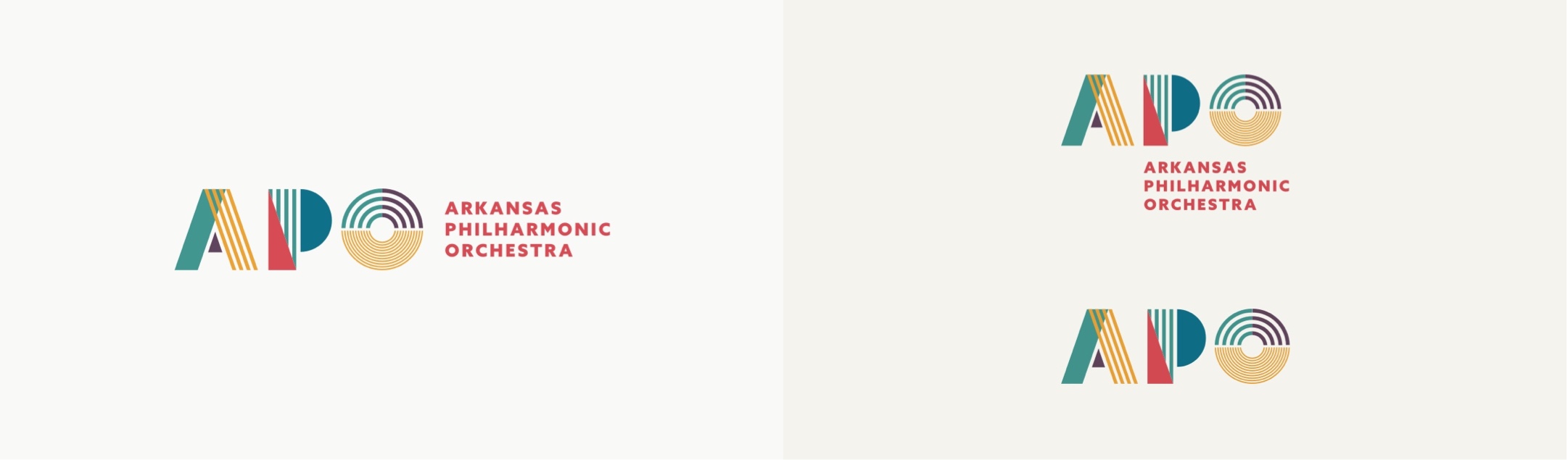
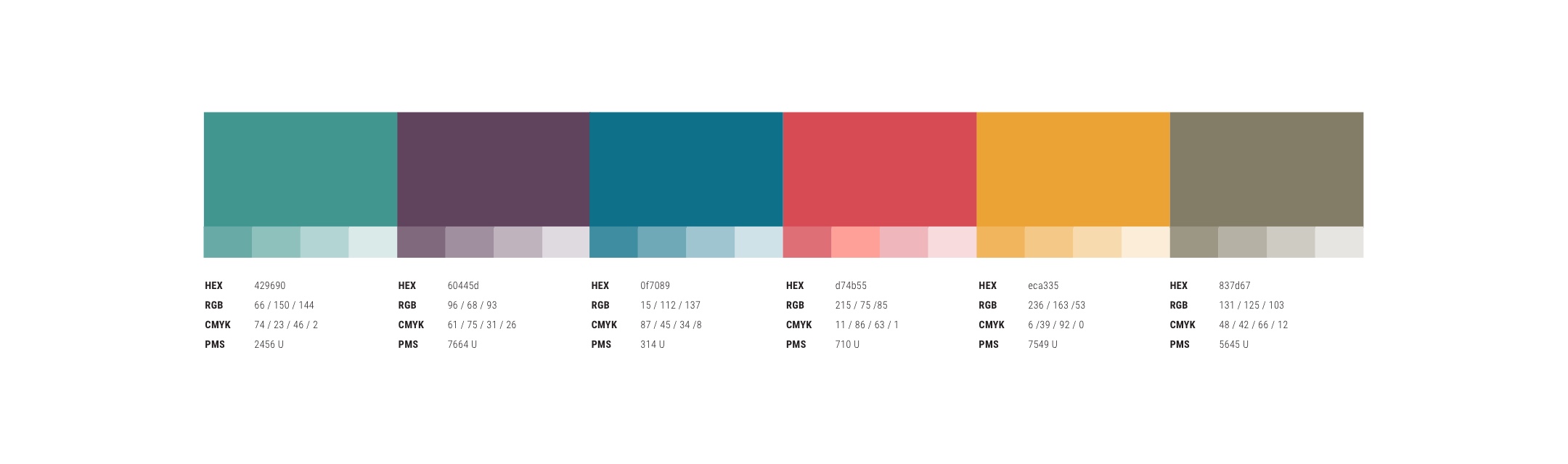
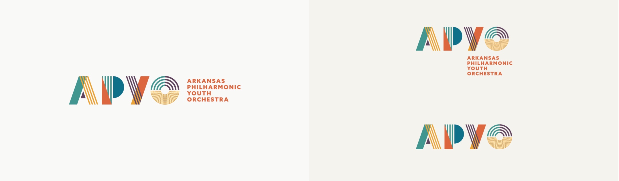
Deserving of its own identity, the APYO logo was designed to complement the overarching brand with similar shapes and lines. The color orange was introduced, which combines the energy of red and the positivity of yellow. It's the perfect addition to the APO palette to represent the youth orchestra.

collateral items


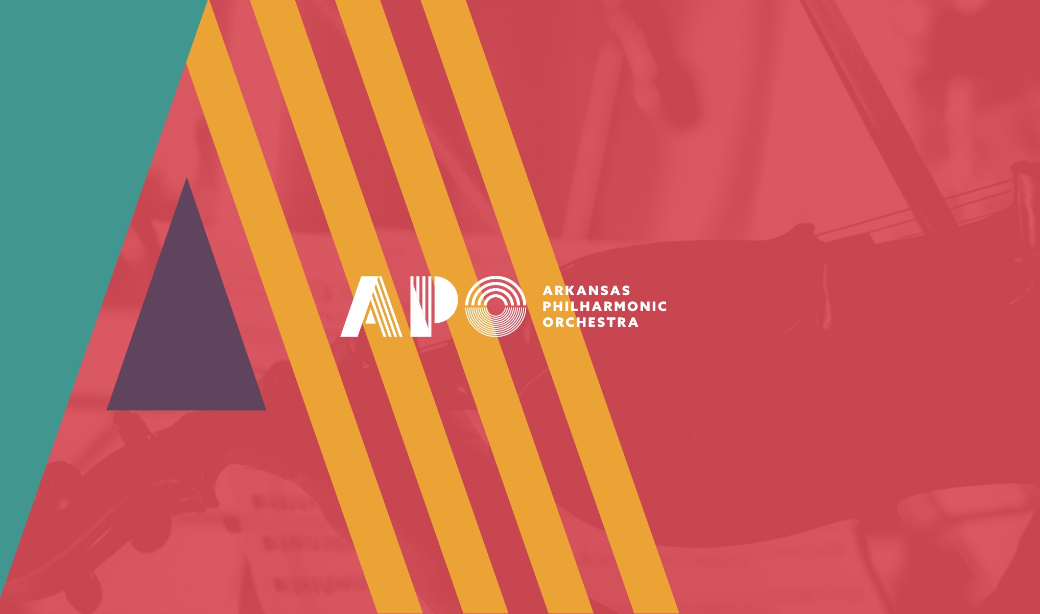
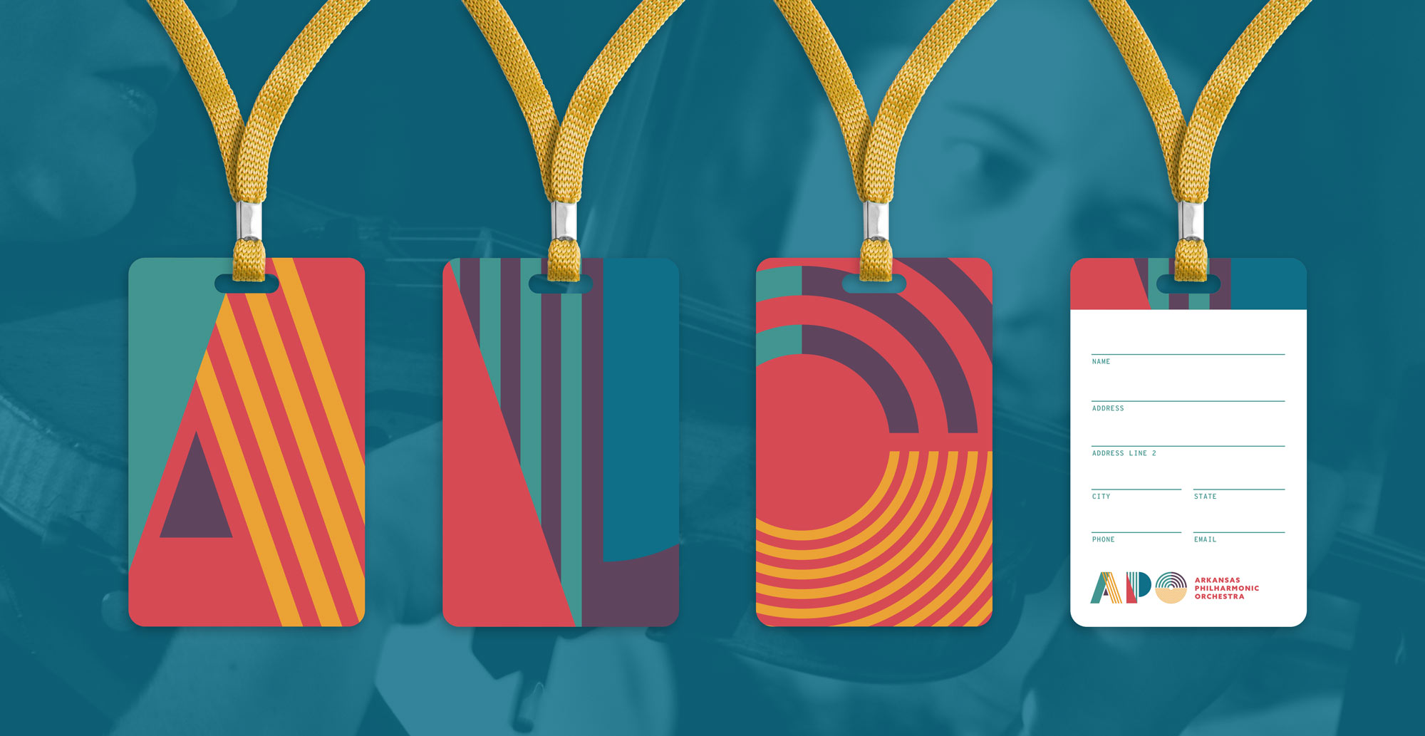
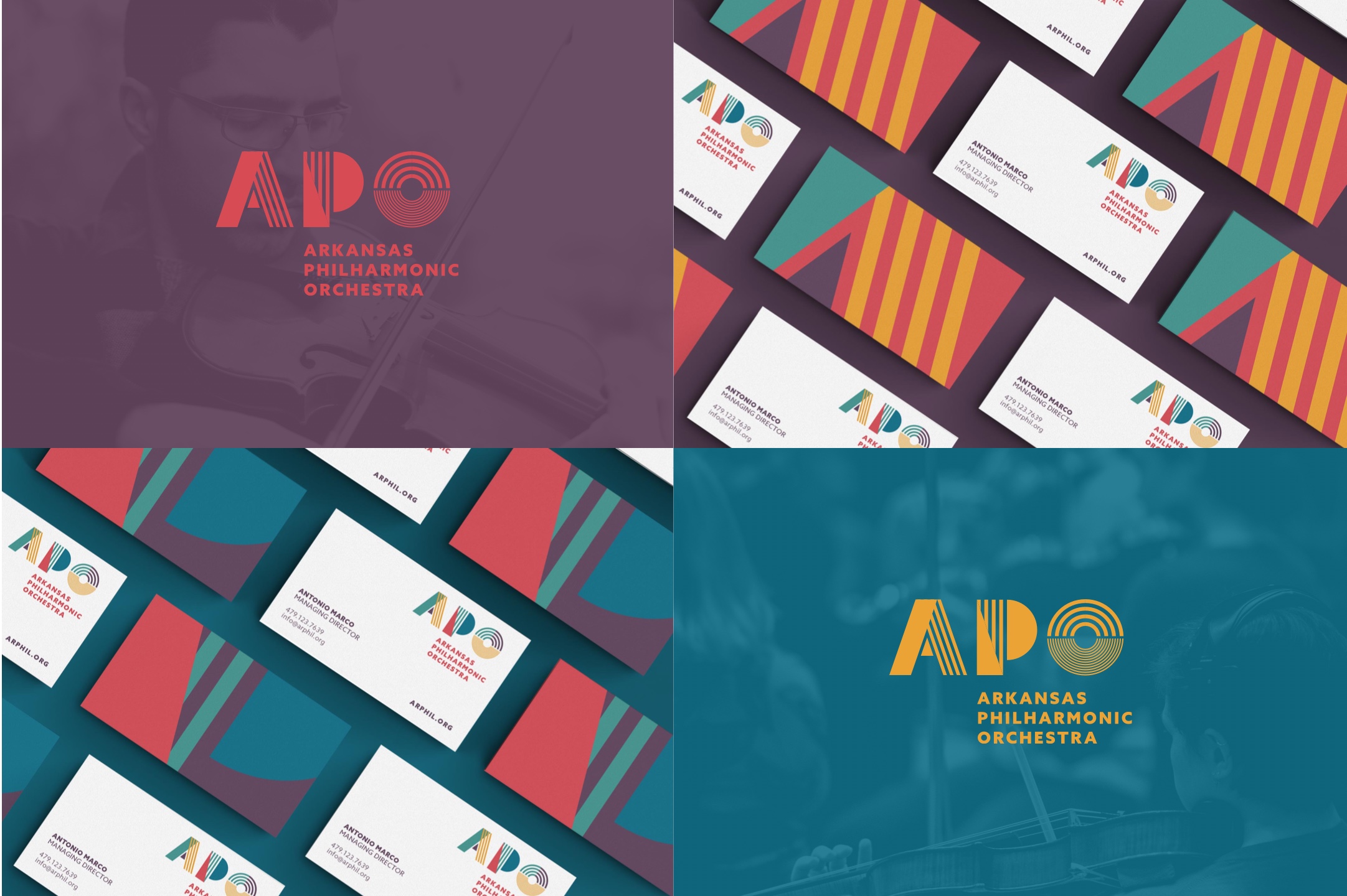
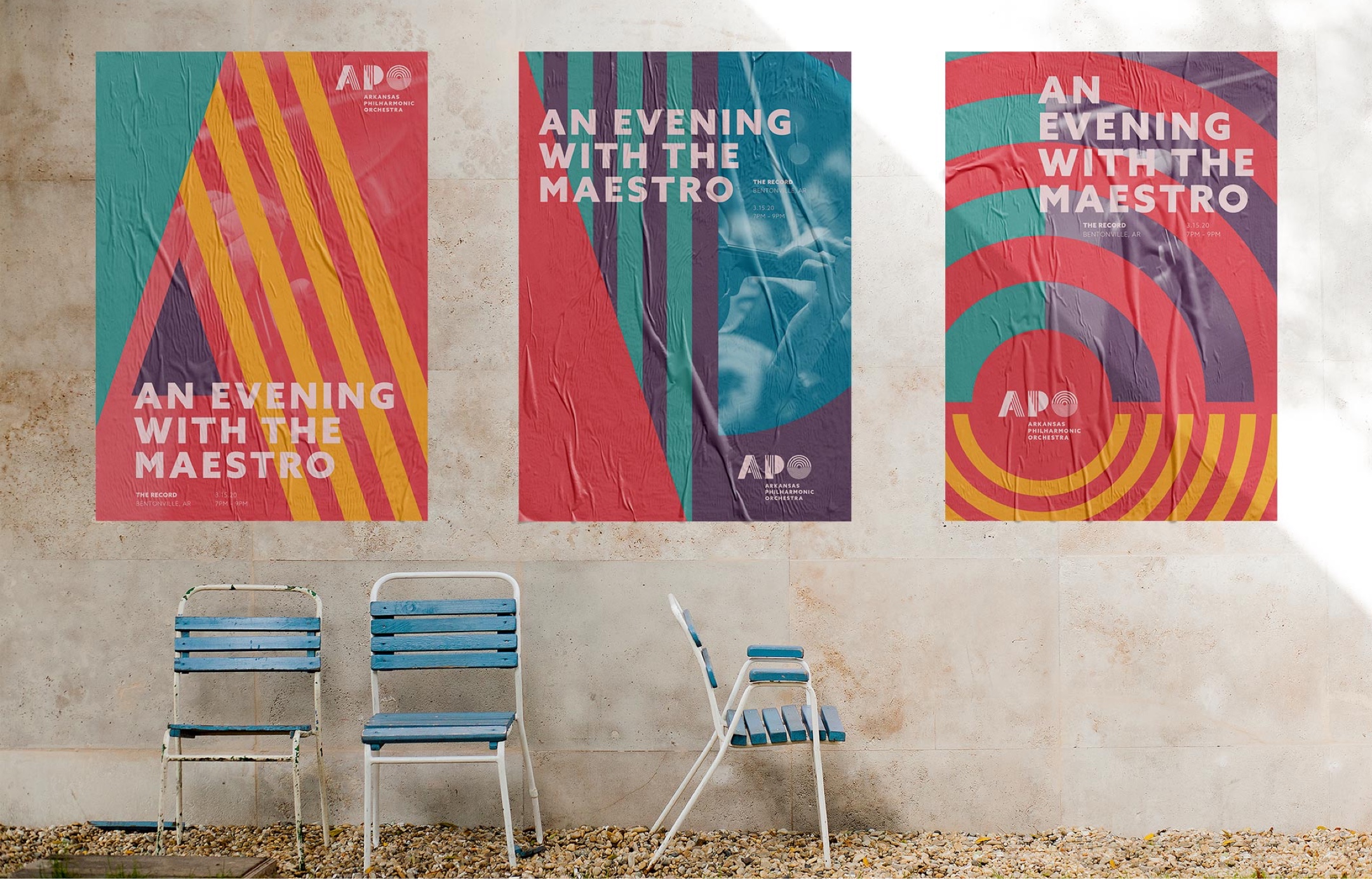
The APO is a unique orchestra in that all of their performances and events are held at various locations across the region. It's an entity that's truly ingrained in Northwest Arkansas. With this in mind, the APO brand extends far beyond a website. We gave thoughtful consideration to the way the logo and colors would be seen, shared, and even worn among the community. The result was a fully designed package that provided a cohesive look for APO. It included luggage tags, tees, business cards, and event posters that are all unmistakable to the brand.

02

web presence

The APO website needed to suit the needs of multiple audiences: patrons wanting to see the latest events, students needing information about programs, visitors excited to watch educational videos, and donors wanting to access the donation portal, just to name a few.
We created a fully responsive, elegantly designed website to meet all of these needs. Built on our Matchstick Framework, the web experience provides superior security, speed, and uptime. And as a content management system, the APO can easily update or add information any time.

access to EVENTS


Having a list of performances that's easy to access is critical for patrons of the APO. With this in mind, we designed an event page that features an intuitive filter, allowing visitors to quickly find the information they need. 

Our Work

VIEW WORK