paradox retail logo with textured background

PROJECT DESCRIPTION


Paradox is a retail marketing advisory firm that cuts through the crap to deliver infinite ideas with measurable results. They believe imagination and metrics don't have to be mutually exclusive. As a start-up company, they needed a creative partner who could develop the full ecosystem of their brand. This included an identity package with the right tone and voice, and a sophisticated web presence that communicated their business concept. Another item on their checklist was working with a team that not only understood, but also knew how to bring to life their no-nonsense, yet friendly vibe. Matchstick was a perfect fit for the job.

SERVICES PROVIDED


Identity Creation
Copywriting
Web Design

Graphic Design
Web Development
CMS
01

AN IDENTITY PARADOX

A full branding package was designed to position Paradox as an expert in creating measurable results for retail brands. There was a lot of thought and planning that went into the development of the identity package, which started with the logo. It features an all lowercase wordmark that's both approachable and modern. The icons were developed out of three triangles that are further sectioned into three shapes. 
The number three is highly meaningful for Paradox, as they have three core values. They also partner with clients and vendors forming a strong working relationship among all three entities. The triangles are designed in the "forward" position, pointing toward the future and indicative of positive growth. The bold, yet soft hues are a paradox unto themselves. 
paradox retail logo progression

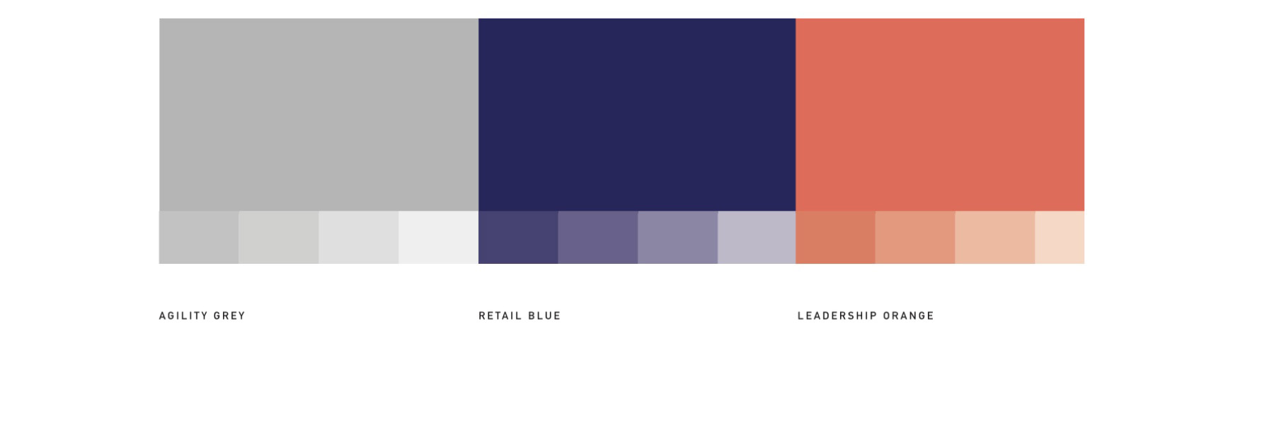
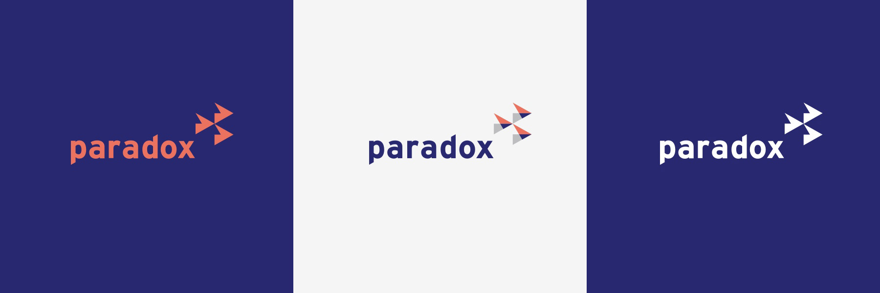
COMMUNICATING WITH COLOR


The color palette was selected with as much intention as the icons within the logo. We began with "retail blue" which leans more toward purple. We love how purple is a visual paradox, combining the calm stability of blue with the fierce energy of red. It also represents a blend of the two largest retail chains in America. Since Paradox works with brands among all retail spaces, it made sense to approach the overall palette in this way. On the opposite side of the color spectrum, we have "leadership orange." This is a highly creative color that represents the bold ideas that come from the team at Paradox. Then, balancing the scale, we added "agility grey" to the mix. This color helps ground all of our designs and provides a practical and sophisticated baseline from which to work. We purposefully chose soft hues within each color spectrum, to further echo the paradox of a daring, yet approachable company. 
paradox retail colors
paradox retail business cards
paradox retail logo in several colors
duotone photo textures
02

CRAFTING A DIGITAL EXPERIENCE

Our goal was to give Paradox a web presence that was representative of the high-caliber work they do. While the company is a start-up, its founders are vastly experienced in their field and have professional connections with major brands and retailers. So, we developed a site that not only demonstrated their professionalism but also impressed an audience that's digitally savvy. Knowing the majority of users would be viewing the site on mobile devices, we took a mobile-first approach to the design and UX.
When it comes to messaging, Paradox is all about cutting to the chase, being unapologetically honest, and empowering brands to bust through perceived barriers in the retail space. The content and tone of the website follows suit with daring and paradoxical statements. The user experience also gets down to business with easy navigation and digestible content. The website was built on the Matchstick Framework and is structured in a way that makes it easy for the company to add case studies and other elements as they grow.
paradox retail desktop website testimonials
paradox retail white logo with duotone textured background

Our Work

VIEW WORK